Designing Posters with AI
Concept, generate and finish print-ready posters in minutes. Here is how to direct AI for bold composition, clean type space and high-resolution output.
June 16, 2026
A great poster does one job: stop someone across a room, then deliver a single message. AI lets you reach a striking, art-directed concept fast — you describe the mood, composition and style, generate high-resolution artwork, and finish with clean typography. The trick is treating AI as your art director for the image, and keeping deliberate control over type and layout.
Posters are composition first
Before you prompt anything, decide the structure. The strongest posters tend to use one of a few proven layouts:
- Hero subject, centered — one bold object or figure, lots of breathing room.
- Off-center with negative space — subject pushed to one side, leaving a clean area for the headline.
- Full-bleed atmosphere — an immersive scene with a quiet band for text.
- Grid or split — two or three zones for image, title and details.
Pick the layout before generating, because your prompt should reserve space for type. Ask explicitly for "clear negative space in the upper third" or "minimal, uncluttered background on the left." A beautiful image with nowhere to put the headline is a failed poster.
Prompt for mood, medium and light
Posters live and die on art direction. Be specific about three layers:
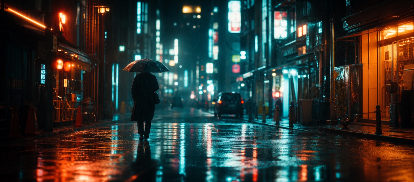
- Visual style — cinematic photography, risograph, bold flat illustration, vintage screen-print, surreal collage, brutalist, art-deco.
- Subject and framing — what is the hero, and how is it framed.
- Light and color — high-contrast dramatic light, soft pastel, neon on black, warm golden hour, two-color duotone.
A vague prompt gives you a generic stock look. A directed one — "bold flat-illustration poster, single oversized coffee cup centered, two-color duotone in burnt orange and cream, clean negative space at top for title, screen-print texture" — gives you something with a point of view. eaxy ships 30+ curated style packs, so you can lock a consistent aesthetic across a poster series. Browse styles in best AI image styles 2026 for direction, and use the structure in our prompting guide.
Resolution and print: get this right
Print is unforgiving. Plan resolution from the start:
- Aim for roughly 300 DPI at your final print size.
- eaxy exports up to 4K, which comfortably covers A3 and many A2 posters.
- Generate in the correct portrait ratio (commonly 2:3 or 3:4) so you are not cropping away pixels later — see AI image aspect ratios.
- For very large or display posters, generate the artwork at max resolution and add headline type as vector in a layout tool, so text stays razor-sharp at any size.
The text problem — and the clean fix
AI image models have improved at rendering words, but they still produce inconsistent letterforms, odd kerning and occasional gibberish, especially in long headlines. For posters, where typography is the design, the reliable workflow is:
- Generate the artwork in eaxy, with reserved negative space.
- Export at the highest resolution.
- Add the headline, subhead and details as real type in a design tool (Figma, Canva, Affinity, InDesign).
- Match the type's weight and color to the image's art direction.
This gives you the best of both: AI's imagery and your control over legible, on-brand text.
A repeatable poster workflow
- Define the message — one headline, one feeling.
- Choose the layout — and the space the title needs.
- Pick a style pack for a consistent look.
- Write a directed prompt — style, subject, light, and reserved negative space.
- Generate variations on /create and curate the strongest composition.
- Export at 4K in the right portrait ratio.
- Set the type in a layout tool and finish.
Build a series, not a one-off
The real payoff is consistency. By reusing one style pack and one layout system, you can produce an entire campaign — event series, product line, content calendar — that looks intentional and unified. The same art-directed stills can also be brought to motion for animated poster ads; see our image-to-video guide and AI for social media content for distribution.
Posters reward taste and decisiveness. Decide the layout, direct the style hard, keep type sharp and print-ready — then start creating and turn a single idea into a wall-ready piece.
Frequently asked questions
Can AI design a print-ready poster?+
AI excels at the visual — composition, art direction and imagery — at high resolution. For crisp, editable text it is usually best to generate the artwork in AI and add the headline type in a design tool.
What resolution do I need for a printed poster?+
Aim for roughly 300 DPI at final size. On eaxy, exports up to 4K give you plenty of detail for A3 and many A2 posters; for very large formats, generate the artwork and scale type as vector.
How do I leave room for the title?+
Prompt for negative space — a clear upper third, a clean band, or an off-center subject — so you have a calm area to place the headline without fighting the image.
Which aspect ratio should a poster use?+
Most posters are portrait, commonly 2:3 or 3:4 (A-series sizes are close to these). Generate in the ratio you will print to avoid cropping away resolution.
Can I use AI posters commercially?+
Yes — eaxy includes a commercial license on Pro and above. Avoid trademarked logos and recognizable real people in commercial poster work.
Make it with eaxy
Describe anything and generate stunning images in seconds — then bring them to motion with Kling 3.